Friday, January 24, 2014

Frozen - Rosemaling

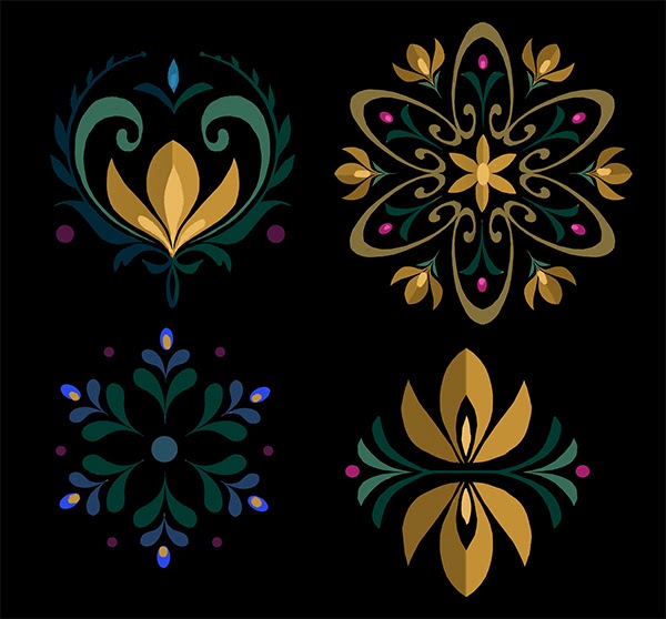
Research is a huge part of what we do. Once the team had decided that Frozen would take place in a kingdom that was based on Norway, a group was sent to Norway to gather as much first-hand reference as possible. While there were many things learned on this trip, the one thing that the team came back with that directly affected my work on the show was the art of rosemaling.


Rosemaling is a type of decorative folk-painting that can be seen just about everywhere in Norway - it is used on everything from architecture to clothing. My fantastic art director, Mike Giaimo, (if you don't know who he is, do yourself a favor and look him up!) decided that we needed to develop our own library of rosemaling for Frozen - and that is where I came in!


My first month or so on Frozen was dedicated solely to creating rosemaling for the world of Arendelle. I worked on everything from wallpaper to tapestries (like the ones above) to painted architectural designs to costumes (there will definitely be more on those later). The great thing that we discovered about our rosemaling was that nothing went to waste. We needed so much of it to propagate throughout the film that even if a design didn't get picked in the first round, we ended up using it later.


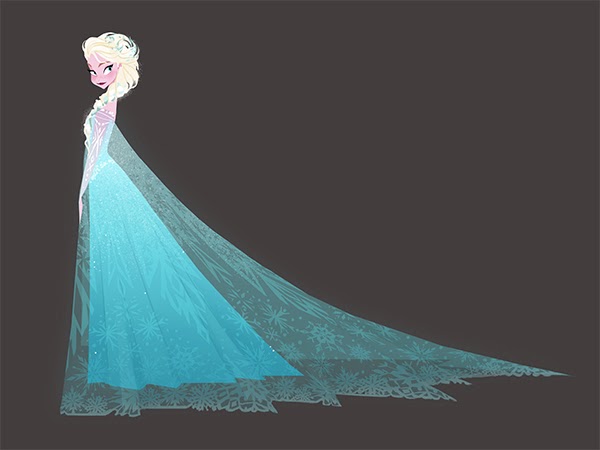
For costuming, we wanted our rosemaling to reinforce each individual character's personality traits. Anna is bright and bubbly, so her rosemaling is always effervescent and floral. Elsa is poised and refined, so she has long, elegant designs with a hint of crystal-like geometry.  Since Kristoff is a bit of an outsider, his patterns are much more geometric and banded, reflecting design elements seen in the clothing of the Saami people of Norway.


The tapestries that hang throughout the castle in Arendelle were a fun challenge. They had to be approached with the design language we established with Arendelle's rosemaling, but with an added element of storytelling. The tapestries below were initially requested as a set of two: one representing Spring and the other representing Winter. Eventually it was decided that we should have all four seasons, so Summer and Fall were added to the mix. 


All images are property of Walt Disney Animation Studios.

I don't think I had any idea when I started on Frozen how prevalent rosemaling would be. Honestly, I was thrilled to just be able to work on the movie, so I happily doodled away for days and days on these designs. Now I look back and am so thrilled to have been given this task. As a visual development artist, it is really rare that your actual work makes it to the final frame of the film. Our jobs are to inspire and inform the artists who make the actual assets, but in this case I get to see my work on the walls and the hems of their skirts. It is magic. 

More to come on Frozen soon, as well as other updates! Thank you so much for your response to the last post, as well as your continued support.  Have a wonderful weekend!


Thursday, January 16, 2014

FROZEN: Elsa and Her Ice Palace


I have been holding off on writing a post about working on this film for some time now - mainly because I haven't been able to find the words to do it justice. I will be grateful for this experience for the rest of my life. The schedule was really tough, but in some ways that made those of us who were working on the film love it (and each other ) even more. It is crazy to think that six months ago, I could (and did) belt "Let it Go" in my car and nobody else knew what the heck I was talking about. Now everybody and their brother is belting it in their car, and I am watching their videos on Youtube. Amazing.


I was so lucky to be able to touch many different aspects of the film. This one, though - she is very near and dear to my heart. The more Elsa's character evolved, the more I felt like I was looking in a mirror. While I can (and probably will) go into more detail about the eerie similarities between the lives of the sisters of Arendelle and the Lee sisters, the thing that really hit home for me immediately was this: Elsa is an artist. She expresses herself through creation. 

Well, hey! I know that girl. 

This characteristic presented an interesting problem. Not only did we need to design Elsa and the world around her, but we needed to design what she would design. Just like her character, this visual language evolved over time, eventually settling on a lyrical rosemaling-inspired treatment for her magic and a sharp-yet-delicate snowflake-inspired treatment for her final creations. I had the great pleasure of working on the interior of the Ice Palace, where a few of these principles went into play. 

These are a few of the pieces I did while working on the palace - This first one was done before we figured out the rules of Elsa's design language. It is ethereal for sure, but not quite right for her. 


The rest of these pieces actually reflect the final design. The snowflake was the key to this world: once we started to base the design around her snowflake (specifically the one on the floor) , the palace was able to grow like snow/ice crystals around her. 


 All images are property of Walt Disney Animation Studios.

I will do a few more Frozen posts over the next couple of weeks to cover different aspects of the film. In the meantime, I hope you all have a lovely weekend!